Once something is on the canvas, the right rail is where you shape it: exact values, colors, effects, and the extra abilities a layer can grow. This page covers the Properties panel end to end.
01The panel at a glance
Select a layer and the Properties tab fills in:
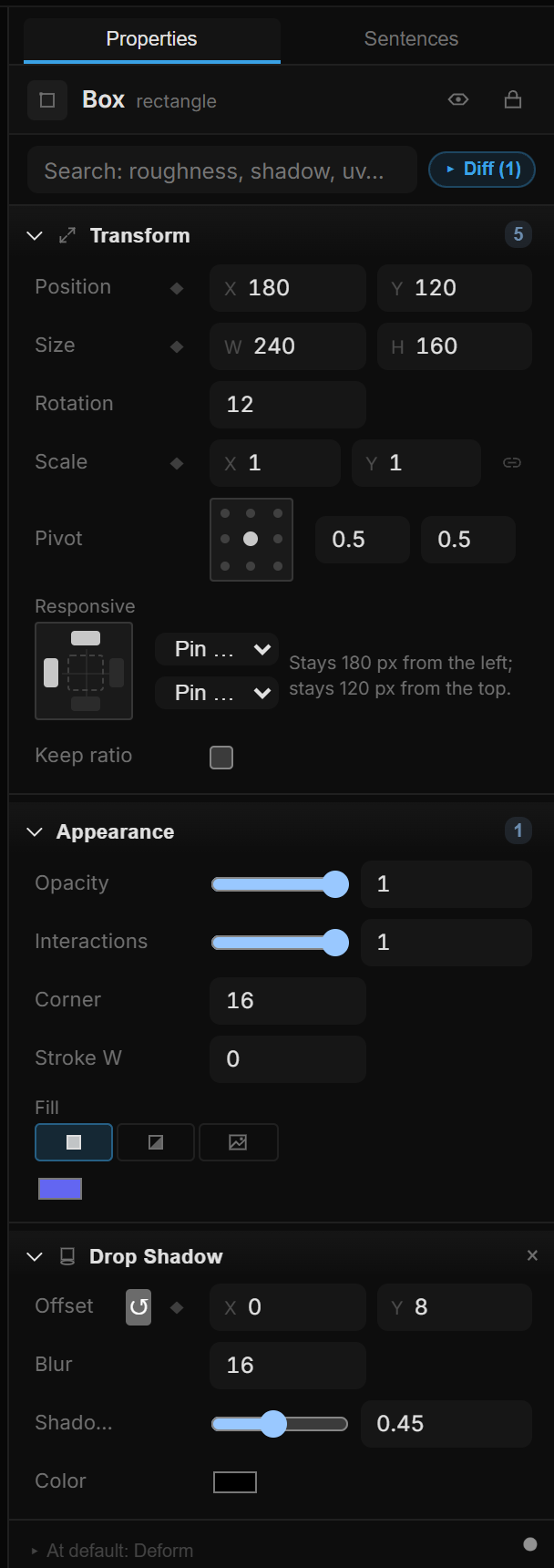
Reading it top to bottom:
- Header — the layer's name and type, plus the eye (hide) and padlock (lock) toggles. Click the name to rename.
- Design / Motion — which rows the panel shows (below).
- Search properties — type any property name ("shadow", "roughness", "blur") to jump straight to it. Abilities you haven't added yet show up in the results too.
- Changed — show only the sections that differ from their defaults. Off by default.
- All · Layout · Shape · Style · Behavior — narrow the panel to one kind of section: where it is (Layout), what shape it has (Shape), how it looks (Style), what it does (Behavior). All is the full list. Only the tabs this layer has appear, and the strip hides when there is just one.
- Sections — Transform, Appearance, Text, Effects and so on. The order never changes between layer types, so your muscle memory keeps working; only which sections appear depends on what you selected. The small number on a section header counts how many values in it differ from their defaults.
- + Add capability — pinned to the bottom of the panel, where a layer grows new abilities. This guide calls it + Add for short.
Design and Motion
The switch at the top decides how much the panel shows:
- Design (the default) is for laying things out. Behavior sections (interactions, states, physics, scroll participation…), Deform, and the keyframe badges on each row stay out of the way, and + Add offers design abilities only.
- Motion shows everything: keyframe badges on every row, Deform, interactions, physics.
Nothing is lost in Design. A section that is already on for this layer, a row you changed, and a badge that reports something — a keyframe, a stream, an expose — stay visible. Searching finds everything in either mode. Hover the switch and the tooltip says how many options Design is hiding.
Several layers at once
Select several layers and the header reads 3 layers with a line like 2 Rectangle · 1 Text. Every edit — fill, stroke, corners, blend, shadow color, text style, hide, lock, and + Add — applies to all of them, as one undo step.
Where the layers disagree, the field says Mixed: a striped color swatch, a Mixed entry in a list, a half-ticked checkbox. Pick a value and every selected layer takes it.
02Editing values
Every number in the panel is the same control, and it takes three kinds of input:
- Drag it to scrub the value up and down — the canvas updates live as you drag.
- Click it and type. The whole value comes selected, so you just type over it.
- Focus it and use the keyboard: ↑/↓ step, PageUp/PageDown step ×10, the mouse wheel steps too, Tab moves to the next field, Esc cancels.
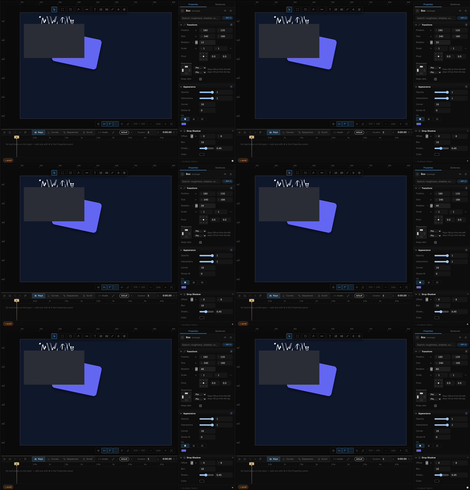
While scrubbing, modifier keys change the sensitivity: Shift ×10 for coarse moves, Alt ×0.1 and Shift+Alt ×0.01 for fine ones. Typed values accept arithmetic too — 100/3 or *2 both work.
Enter commits the value; Esc leaves the field — so canvas shortcuts like Ctrl+D work again straight away. Picking from a list with the mouse also hands the keyboard back to the canvas — the arrow keys nudge the layer, not the list.
A whole drag is one undo step, not hundreds, so Ctrl+Z takes you back to where you started rather than crawling backwards one pixel at a time.
03The halo — adjusting without leaving the canvas
Press Tab and the most relevant parameters float right next to your selection: the values that already differ from their defaults first, then the usual suspects (position, size, opacity).
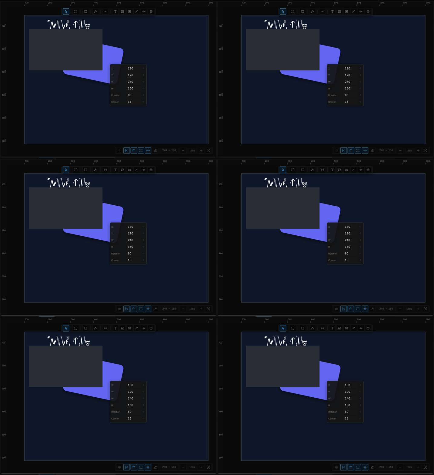
The chips are the same controls as the panel — same scrubbing, same badges — so nothing behaves differently out here. It exists so small tweaks don't cost you a trip across the screen.
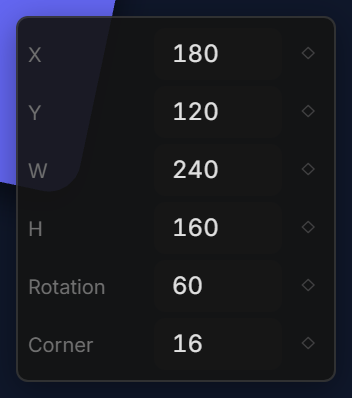
Tab again closes it. The halo hides itself in play mode and path editing, where the canvas is busy with something else.
04The badge next to every value
That small diamond beside a property is both a button and a status light. In Design mode it only appears when it has something to report — a keyframe, a stream, an expose, another writer; switch to Motion to see it on every row.
| Badge | Means |
|---|---|
| ◇ dim | Nothing special — click to drop a keyframe here |
| ◆ yellow | A keyframe sits exactly at the playhead |
| ◇ yellow | This property is animated, but the playhead is elsewhere |
| ∿ purple | A live stream drives this value (audio, mouse, a variable…) |
| ● green | The value is exposed under a name |
| ⚠ | Something else is also writing this value — click to open the rule that's losing |
Left-click adds a keyframe at the playhead instantly — no menu, no mode. Right-click opens the deeper actions:
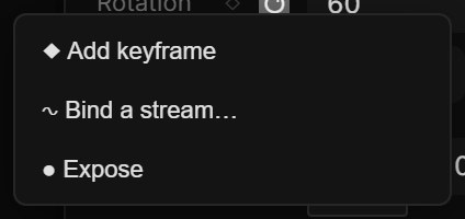
Expose (●)
● Expose publishes this numeric property under a name. The default name is {layer}.{property} — card.opacity. The badge turns ● green; the tooltip reads Exposed: {name} — right-click: actions. ● Remove expose takes the name back.
Once exposed, the property shows up in stream pickers under the group Exposed. A component master can also expose text and fill from those rows — that list is Components.
Keyframes are in Timeline & animation; streams and expressions in Streams & variables. The thing to remember here is that the badge always tells you who is writing this value — if a rule or physics is driving a property, the badge says so instead of silently letting you fight it.
05Changed — a panel that stays short
Press Changed and the panel keeps only the sections where something differs from its default — on most layers, what you actually touched. Press it again for the full list. If nothing has changed yet in the current tab, the panel says so and offers show all N sections.
The category tabs and Changed work together: Style + Changed is "every look setting I changed on this layer".
06+ Add — growing a layer's abilities
A layer starts simple and gains abilities as you need them. + Add capability at the bottom of the panel opens a searchable list of everything this layer can become, with a one-line hint for each. The number on the button says how many are on offer:
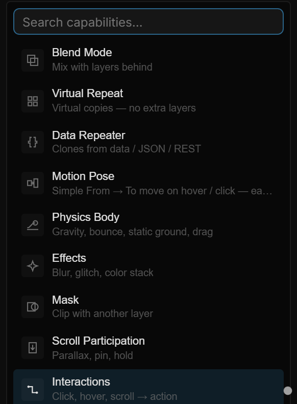
Pick one and it becomes a normal section in the panel, right where it belongs in the fixed order. With several layers selected, it is added to all of them.
What's on offer:
| Ability | What it gives the layer |
|---|---|
| Layout Grid | Column / row guides to align to (frames and groups) — Layout grids |
| Layout | Auto-arranges children in a row, column or grid (frames and groups) — Layout & Cascade |
| Cascade | Staggers children so they enter in sequence |
| Blend | Mixes with the layers behind (multiply, screen, overlay…) |
| Drop Shadow | Drop and inner shadows, with offset, blur, spread and color |
| Layer Blur | Blurs the layer itself — a soft glow |
| Background Blur | Blurs what is behind the layer — frosted glass |
| Virtual Repeat | Many copies without extra layers |
| Data Repeater | Clones driven by data — JSON, a REST endpoint |
| Input · Slider · Toggle · Choice | Form controls a visitor can use — Fields |
| Motion Pose | A From → To transform that plays on hover or click |
| Physics Body | Gravity, bounce, drag, collisions |
| Physics World | The gravity every body inside an artboard feels |
| Custom Cursor | Replaces the pointer inside an artboard |
| Effects | The GL effect stack — see Effects |
| Mask | Clip this layer with another one |
| Scroll Participation | Parallax, pinning, holding in place |
| States | Named states and the transitions between them |
| Interactions | Click / hover / scroll → action |
| Clones | Grid / ring / spiral copies of a mesh |
| Field | Cursor or point that bends a mesh or shifts its clones |
In Design mode the list offers the design abilities; switch to Motion, or type in the search, to reach interactions, physics and controls. The live list — who can add what, and the right-click Add groups — is Capabilities.
Two behaviors worth knowing:
- Abilities that don't apply are never offered. A 3D mesh doesn't get Drop Shadow, because the control would be a promise the renderer can't keep.
- Removing an ability switches it off. The
×on a section turns it off with one undo step. Most abilities keep what you configured, so adding them back restores it; a value-only ability (Blend, Layer Blur, Background Blur) goes back to its default, and removing Drop Shadow or Layout Grid clears their lists.
07Effects
Add Effects and you get a stack — effects apply in order, top to bottom. The Effects category of this guide goes deeper — start with Effects on a layer vs the Effect Layer, then The effect stack; every effect and its parameters is in the Effect reference. Click + Effect to open the catalog:
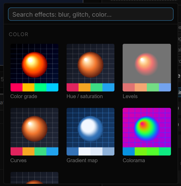
Every card is a real preview — the effect's own shader applied to one shared test image — so you can tell Kaleidoscope from Mirror without adding either. Search across names and categories, or browse the five groups: color, blur, distort, stylize, light.
Pick one and it lands on the canvas immediately:
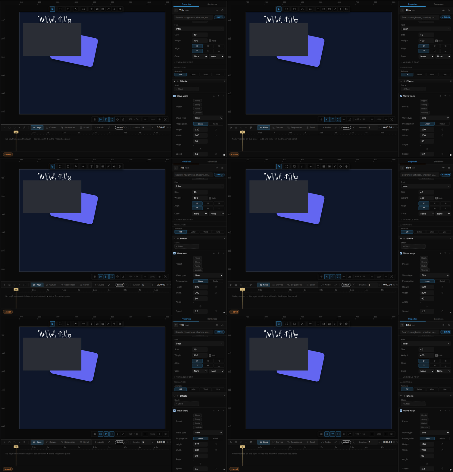
Each effect brings its own parameters, and most bring presets — a fast way to a good-looking starting point before you touch a single number:

In the stack, each effect has a checkbox to mute it temporarily, ▲▼ to change its place in the order, and × to remove it. Muting is how you compare with and without, without losing your settings.
Affecting several layers at once
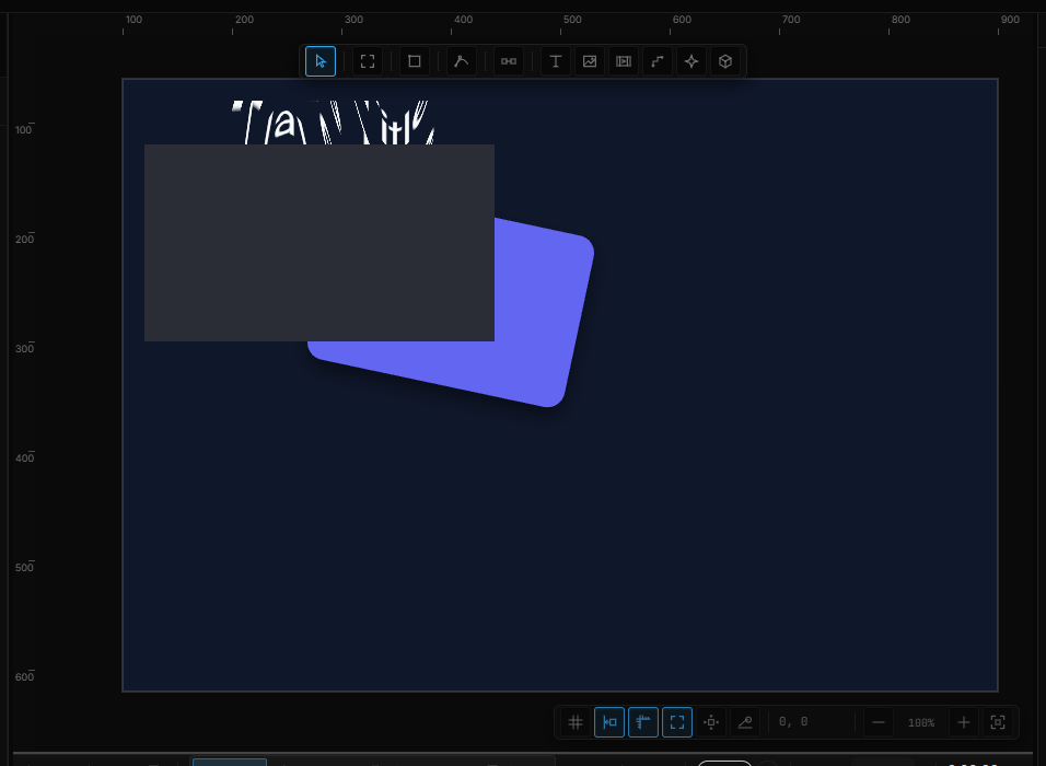
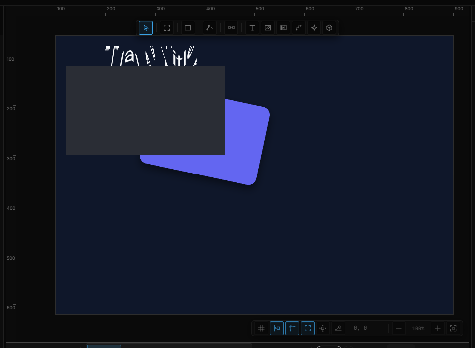
An effect on a layer changes that layer. To treat a whole composition as one image — and warp, blur or grade all of it together — use an Effect Layer (Shift+E): draw it over your artwork and it applies to everything beneath it.
| Before | With a kaleidoscope effect layer on top |
|---|---|
 |  |
08The standard sections
What you'll meet on most layers:
- Transform — position, size, rotation, scale, Pivot (the 9-dot grid picks the rotation/scale center, or type your own) and, for a layer inside a frame or group, Responsive (below). A top-level artboard adds Fit; a group adds Contents — whether resizing it scales what's inside.
- Appearance — fill (none, solid, gradient or image), opacity, corners, stroke with its Align, and ring cut-outs on ellipses. The rows are in Styling, masks & blend.
- Text — style, font, weight, size, alignment, spacing and text animation. See Text below.
- Layout / Item Layout / Layout Grid — auto layout on a container, the per-child settings, and column guides. See Layout & Cascade.
- Scroll — how far and how smoothly an artboard scrolls. In Design mode it only shows on an artboard whose scrolling is on (Scroll).
- Component — main component and instance controls. See Components.
09Text
Select a text layer and the Text section starts with typography, top to bottom:
| Row | What it does |
|---|---|
| Style | A named text style — see Text and effect styles |
| Selection | Only while you are typing with part of the text selected: B, I, U, S, a weight and a color for just those characters. Where they differ, the field reads Mixed |
| Font | The font family. Under it, a font token when the theme has one — the family then follows the token; picking a font by hand unbinds it |
| Weight | Only the weights this font really has, by name — Regular, Semibold, Bold… A weight the font lacks is marked (not in this font). The checkbox beside it is italic |
| Size | The font size, in px |
| Align | Horizontal and vertical alignment |
| Case | Letter case, plus underline / strikethrough |
| Paragraph | Extra space after each paragraph — a line you start with Enter |
| Word break | How a word longer than the box wraps |
| Max lines | A line limit (0 = none), with an option to end the last visible line with … |
Then the shared rows — line height, letter spacing, the text content, Resizing (Auto width, Auto height, Fixed size) — and at the end Break Apart (Explode to characters, one layer per letter) and the animation block.
A variable font adds a Variable font block with the font's own Font axes as sliders, its built-in styles under Named style…, and axis effects — see Text animation.
Every text change is one undo step, including a change of font, weight or alignment and the box resize it causes.
10Text and effect styles
A style is a named set of values that many layers share. Change the style and every layer using it follows.
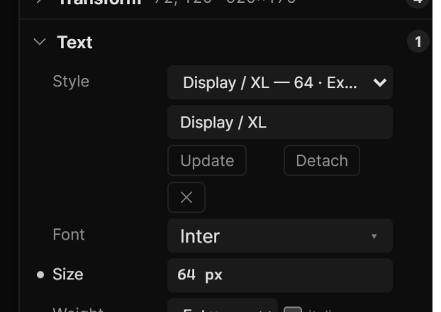
- Text styles hold the family, weight, size, line height, letter and paragraph spacing, italic, decoration and case. The Style row sits at the top of the Text section.
- Effect styles hold shadows (one or a list) and layer and background blur. The Style row sits at the top of the Drop Shadow section.
How it works:
- Style one layer the way you want. In Style, pick + Create style from this layer.
- Select other layers — several at once is fine — and pick the style from the same list. Each entry shows a summary, like 32 · Bold · Inter.
- While a layer uses a style, the row under it shows the style's name (click to rename), Update (write this layer's current values into the style — every layer using it updates), Detach (keep the look, stop following) and ✕ (delete the style; the layers keep their look).
Change a styled value by hand on one layer and that layer quietly stops following the style. Styles are saved with the scene, and copies keep their link.
11Responsive
Responsive is the part of Transform that says what a layer does when the frame around it changes size — pin to an edge, keep the center, stretch between two edges, or scale with it, with optional width and height limits and a Keep ratio switch. The sentence under the pin box reads the rule back in words. It works inside any frame or group, not only a page. It has its own page: Responsive & Screens.
A footer button that should stay 24 px from the right is Pin right + Pin bottom. A hero image that must fill the frame is Stretch (left + right) + Stretch (top + bottom).
123D sections
On 3D layers the rows are named after what you selected:
- Model / 3D Text / Geometry — the mesh section takes the name of the mesh type: Model for an imported file (source, animation clips, parts), 3D Text for extruded text (font, shape), Geometry for a primitive (kind, segments, display).
- Material (or Materials on an imported model) — how a surface responds to light: presets, color, metalness, roughness, emissive, and the Textures slots.
- Clones and Field — added from + Add on a mesh: copies in a grid, ring or spiral with their own clone effects; and a cursor or fixed-point field that bends the surface or shifts the clones.
- Environment — on a 3D scene: Look (background, fog, studio environment) and Render quality (ambient occlusion, depth of field, bloom, global illumination, shadows).
- Editor — on a 3D scene: grid, editor camera and gesture speed — settings for you, not for the rendered result.
- Camera — on a 3D scene, right after Transform: orbit or free, angle, distance, look-at, field of view.
The full section-by-layer-type list is in Properties by layer type.
13Shortcut recap
| Values | drag = scrub · click = type · ↑↓ step · PageUp/Dn ×10 · Tab next field · Esc cancel |
| While scrubbing | Shift ×10 · Alt ×0.1 · Shift+Alt ×0.01 |
| Halo | Tab open / close |
| Text selection | Ctrl+B bold · Ctrl+I italic · Ctrl+U underline · Ctrl+Shift+X strikethrough |
| Badge | click = keyframe at playhead · right-click = stream, expose, clear |
| Effect layer | Shift+E |