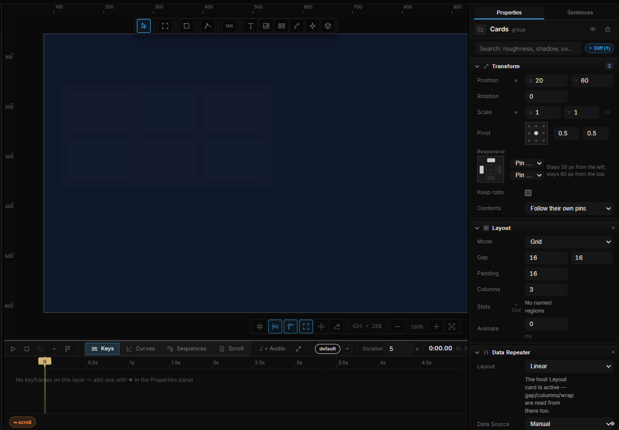
Three abilities a frame or group can grow through + Add: Layout arranges its children for you, Layout Grid draws column guides to align to, Cascade brings them in one after another. Both live in the Properties panel — read Properties & styling if + Add is new to you.
01Quick tour
- Select a few layers that roughly sit in a row and press Shift+A (Add auto layout). They are wrapped in a frame with Layout on — direction, gap, padding and alignment are read from how they already sit.
- Change Mode to Vertical (stack). The children line up; Gap and Padding space them.
- Add Cascade, drag Progress from 0 to 100 — the children fade up in sequence.
02Layout
The Layout section arranges the direct children of the container. Which rows you see depends on the Mode:
| Mode | What it does | Rows it shows |
|---|---|---|
| Free (no layout) | Nothing moves — the default for a group | — |
| Vertical (stack) | Children one under another | Wrap, Justify, Gap (vertical), Align |
| Horizontal (stack) | Children side by side | Wrap, Justify, Gap (horizontal), Align |
| Grid | Rows and columns | Gap (both), Columns |
| Flex | A stack with a chosen direction that can wrap | Direction, Wrap, Justify, Gap (both), Align |
| Circle | Children spaced evenly on a circle or arc | Radius, Start angle, Face center, Sweep |
Rows common to every mode:
| Row | What it does |
|---|---|
| Gap | Space between children — one field per axis the mode uses |
| Padding | Inner padding on all four sides |
| Sides | Top, right, bottom and left padding one by one (not in Circle) |
| Size | W: Hug / W: Fixed and H: Hug / H: Fixed — whether the container's width and height follow its content or stay put while the flow aligns inside. Not on a page, and not in Circle |
| Slots | Named regions inside the container (see below) |
| Animate | How long a reflow takes, in ms. 0 = instant; anything above it eases every child into its new place when the layout changes |
And the mode-specific ones:
| Row | Mode | Values |
|---|---|---|
| Direction | Flex | Row, Column, Row ↩, Column ↩ |
| Wrap | Stacks, Flex | Off / On — start a new line when the children overflow |
| Justify | Stacks, Flex | Start, Center, End, Space between, Space around, Space evenly — along the flow |
| Align | Stacks, Flex | Where children sit across the flow: To start, Center, To end |
| Columns | Grid | 1–64 |
| Radius | Circle | In px; 0 fits the container's shorter side |
| Start angle | Circle | −90 starts at the top, 0 at the right |
| Face center | Circle | Rotate each child so its top points at the center |
| Sweep | Circle | Degrees of arc; 360 is a full circle, 180 a half |
Hug and Fixed
A button that grows with its label is W: Hug; a card of a set width is W: Fixed. A hugging container has no spare room along its flow, so Justify only matters on a fixed axis. Resize a hugging container by hand — with the handles or in Transform — and that axis switches to Fixed, since you just gave it a size.
Changing a layout setting reflows the containers around it too: a card that grows in a row pushes its neighbors. A layout change and the reflow it causes are one undo step.
Slots
A slot is a named rectangle inside the container — header, sidebar — that a child can be pinned to instead of flowing. + Slot adds one; each row has X, Y, W, H and ×. A child chooses its slot in its own Item Layout section.
03Item Layout
Select a child of a container that has Layout on, and an Item Layout section appears on the child:
| Row | Values | What it does |
|---|---|---|
| Position | Flow, Absolute | Absolute takes the child out of the flow — it keeps the X/Y you give it |
| Slot | one of the parent's slots, or — | Pin the child to a named region (only when the parent has slots) |
| Size W / Size H | Fixed, Hug, Fill | Fixed keeps your size; Hug shrinks to the content; Fill stretches to the container |
| Align self | Auto (container), Start, Center, End, Stretch | Overrides the parent's Align for this child |
| Margin | four numbers | Extra space around this child — top, right, bottom, left (not for Absolute) |
| Grow | number | When several children are Fill, each one's share of the free space |
| Order | number | Lower comes first; ties keep layer order |
| Col span / Row span | 1–12 | Grid only — how many cells the child spans |
04When the container resizes
A layout re-solves whenever its container changes size — dragged by its handles, typed in Transform, stretched by its Responsive rule, or a Fluid artboard following the window. The children are laid out again, never scaled; to scale the whole thing, content included, use the Scale tool (K). Children set to Fill grow and shrink with it; a group whose Responsive rule is Stretch keeps the width it is given instead of hugging its content, so Justify can spread children across it.
05Layout grids
A layout grid is a set of column (or row) guides on a frame — the 12-column grid of a web page. It is drawn only in the editor, never in the player or an export, and while it is visible its edges are snap targets: drag a card and it clicks onto the columns.
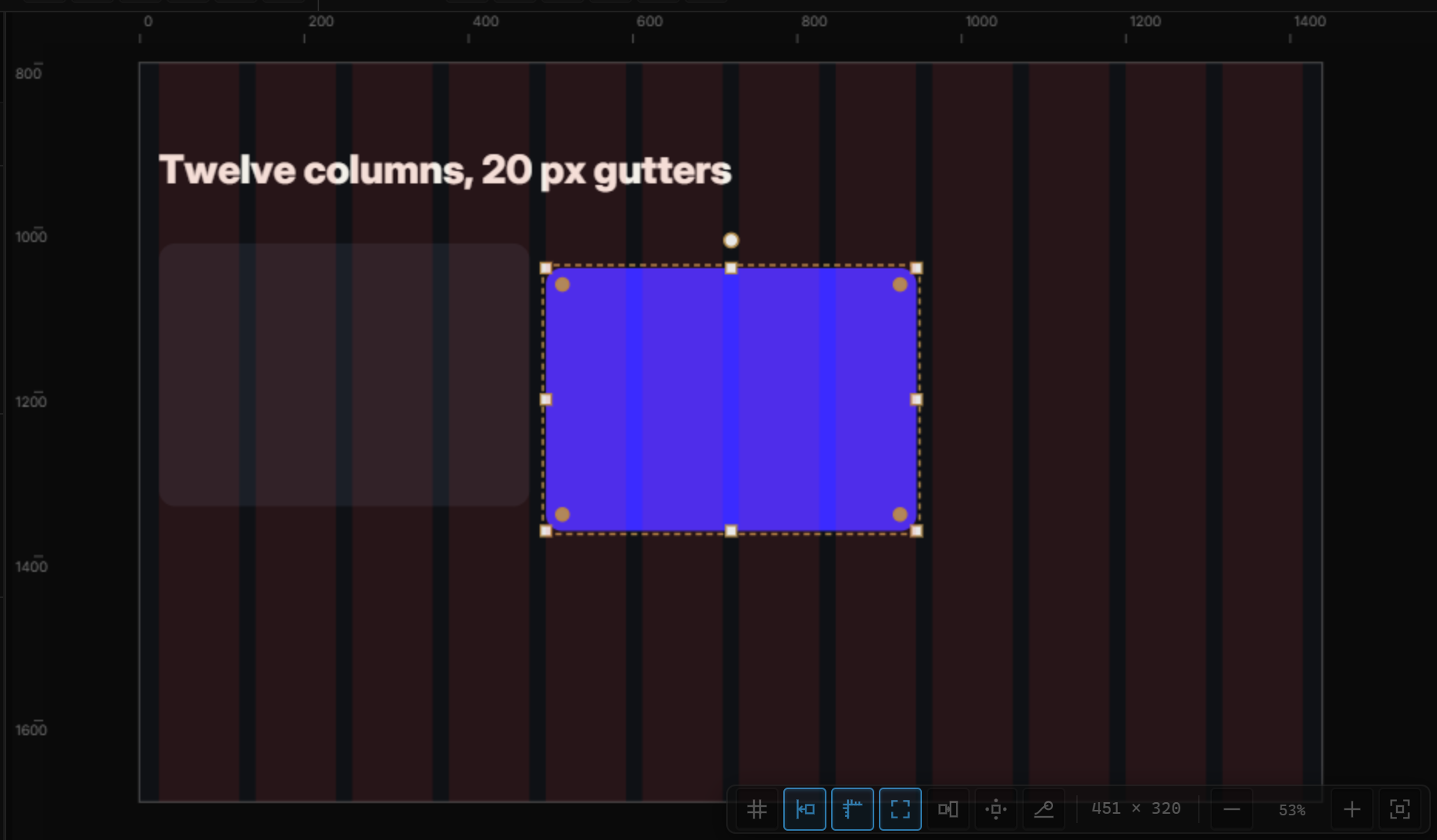
+ Add → Layout Grid on a frame or group adds a 12-column grid (20 px gutter, 24 px margin). Each grid in the Grids list has:
| Control | What it does |
|---|---|
| Kind | Columns and Rows stretch across the frame; Grid is a square grid |
| Checkbox | Show this grid. A hidden grid is not a snap target |
| Count · gutter · margin | For Columns and Rows: how many, the gap between them, the space at both edges |
| Cell size | For Grid: the size of one square |
| Color | The grid's color and opacity |
| ✕ | Remove this grid |
+ Grid adds another — columns and rows together, say. Ctrl+Shift+4 shows or hides every layout grid at once (also Layout grids in the empty-canvas right-click menu and Settings › Canvas). Grids are saved with the frame and copied with it.
06Changing a layout from a rule
The Layout target in Sentences becomes a Set Layout action with Gap and Columns. Give it a duration and the reflow animates — the same easing as the Animate row.
07Cascade
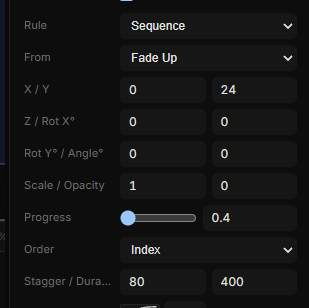
Cascade is an entrance: every child starts in a "from" state — faded, shifted, small — and eases into place with its own delay. Add it from + Add on a group or an artboard.
| Row | What it does |
|---|---|
| Rule | Sequence (one after another), Focus (the child nearest a focus point is "in", the rest fall away), Wave (a sine ripple across the children) |
| From | The starting pose: Fade Up, Fade In, Slide Left, Slide Right, Scale Pop |
| X / Y, Z / Rot X°, Rot Y° / Angle°, Scale / Opacity | The starting pose, field by field. The preset fills them in; type to override any one. Reset to preset clears your overrides |
| Progress | 0–100 — the master dial. 0 is everything at "from", 100 is everything in place |
Rows per rule:
| Rule | Rows |
|---|---|
| Sequence | Order (Index, Reverse, Random, Center), Stagger / Duration ms (delay between children, and how long each takes), Easing |
| Focus | Focus / Range — which child index is in focus (fractions blend), and how many units away the "from" state is fully reached |
| Wave | Frequency / Phase — cycles per child, and a phase offset in degrees |
Playing it
Nothing plays by itself: Progress is the driver, and it's an ordinary property.
- Keyframe it — 0 at the start of a sequence, 100 half a second later.
- Bind it to a ∿ stream — a scroll section, a hover, a variable (Streams & variables).
- Tween it from a rule with Set Property.
For the Wave rule, animate Phase instead and the ripple travels along the children. For Focus, tween Focus to move the spotlight — a click on a card can write its own index there.