A component is a design you mark as the main component (the master). Every instance you place is a live copy: change the master and all of them follow; change an instance and only that one differs. This page covers making components, placing and editing instances, variants and properties, components inside components, and the Components artboard that keeps them tidy.
01Quick tour
- Select a card (a group, a frame, or a few layers) and press Ctrl+Alt+K. It becomes a main component right where it is.
- Alt+drag it — or Ctrl+D — and you get an instance, not a second master.
- Edit the master. Watch the instance update.
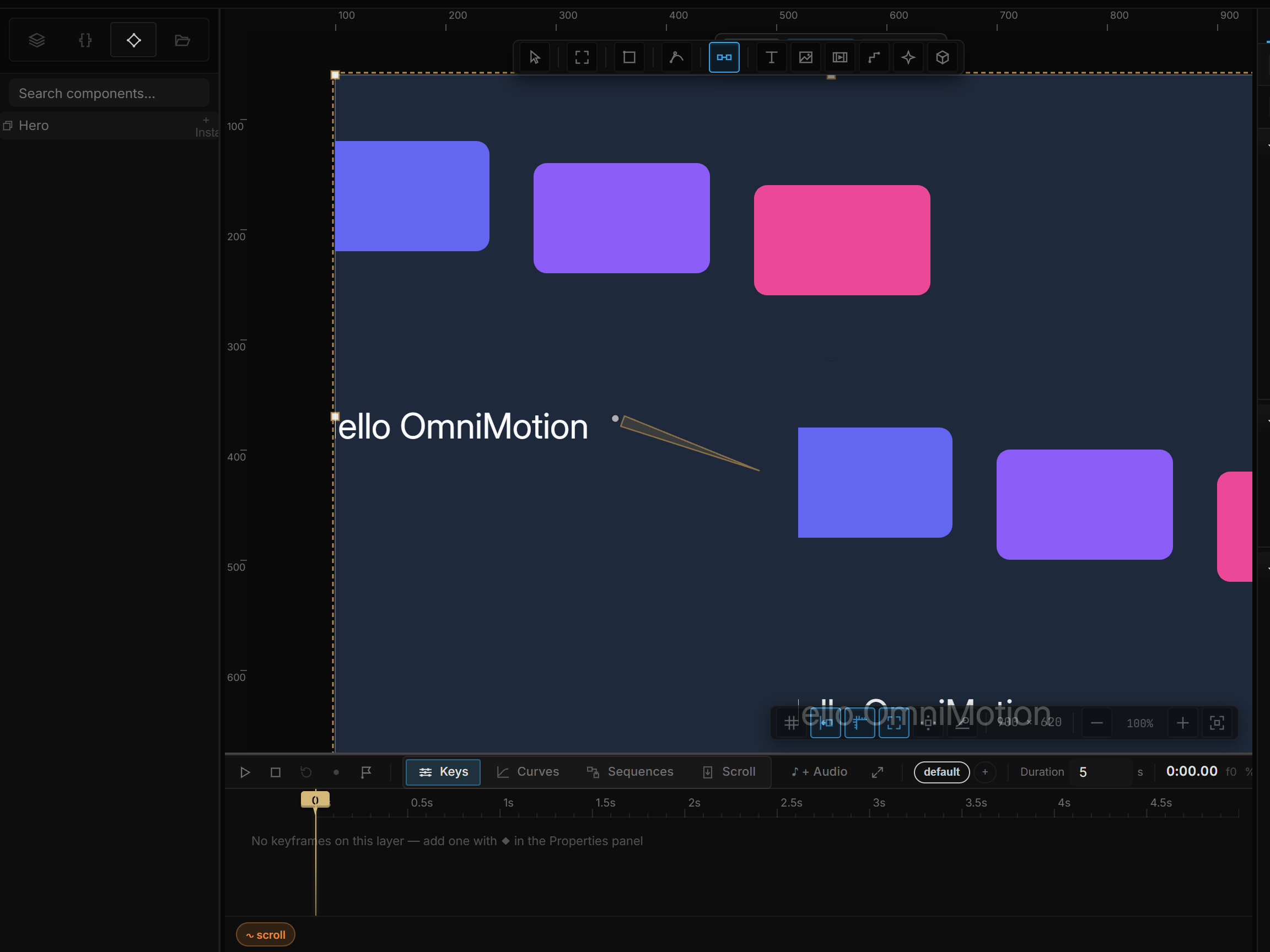
02Making a component
| Start from | How |
|---|---|
| Any layer, group or several layers | Right-click → Create component, or Ctrl+Alt+K. Nothing moves: a group becomes the master itself (it keeps its name, keyframes and rules); a single shape or several layers are wrapped in a frame first |
| An artboard | Master in the pill above it, or the Master checkbox in Properties › Component |
| A whole page with repeats | Detect components — see below |
A page artboard can't become a component itself — select its content instead. An instance can't either: detach it first (Ctrl+Alt+B).
A master can live anywhere — on the page it came from, or in the Components artboard. Click a master on the page to select it as one unit, double-click to go inside it.
03Placing instances
| From | How |
|---|---|
| The master itself | Alt+drag, Ctrl+D, or copy and paste — copies of a main component are instances |
| The master's pill | + Instance — lands beside the master |
| The Components tab | Drag a component onto the canvas — dropped on an artboard, it goes inside it. Place puts one beside the master |
| Another artboard's pill | Use existing lists every master — pick one to place an instance next to this artboard |
Instances scroll independently: each has its own Scroll section and its own scroll position, so three instances of a feed can each sit at a different offset.
Swap in Properties › Component turns an instance into an instance of another component. It keeps its place; overrides from the old component are cleared.
04Editing inside an instance
- Click selects the instance. Properties edits the instance as a whole.
- Double-click goes inside: the part under the pointer is outlined, the pill shows Editing: name, and whatever you change — color, size, text — is an override on this instance only. The master is untouched.
- Double-click a text part and type straight on the canvas. The whole edit is one undo step; Esc, Ctrl+Enter or clicking away finishes.
- While inside, a single click moves to a neighbouring part. Esc steps out, then deselects. × on the Editing tag also leaves.
- Delete on a part hides it in this instance only (Hide in this instance) — parts of a component can't be deleted from an instance.
In the Layers tab, an instance opens to show its master's parts as faint rows. Click one to edit that part of this instance; the structure itself can only change in the master.
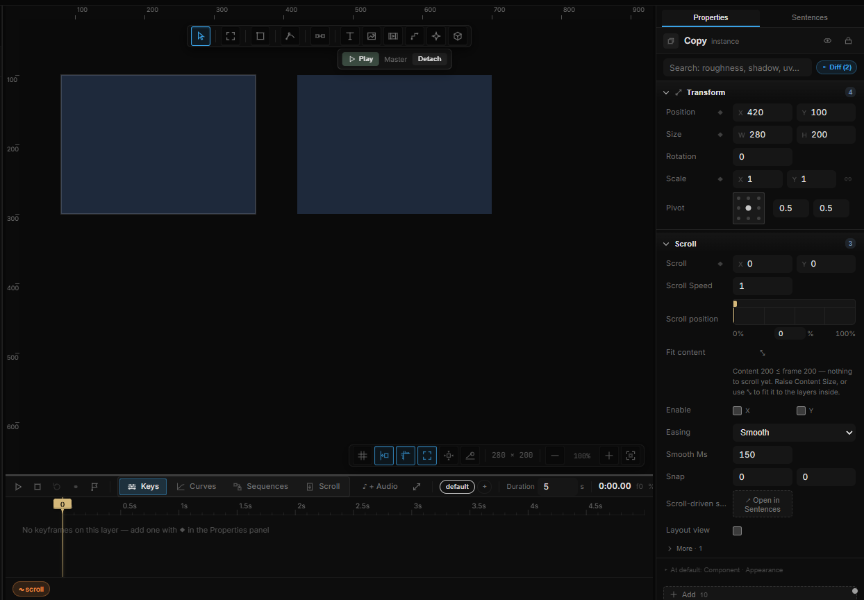
When an instance sizes itself
If the master has Layout, each instance lays itself out with its own content. A button with a longer label grows; a row whose badge says Pending makes room for it; hiding a part with a property (below) closes the gap. Instances in a list can each be a different height.
05The Component section
On an instance:
| Row | What it does |
|---|---|
| Source | The master it follows. When the master has variants without axes, a dropdown of them |
| Swap | Replace it with an instance of another component |
| Axis rows | One dropdown per variant axis — Type, Size, State… (see Variants) |
| Property rows | One control per component property — text, color, checkbox, or a component picker (see Properties) |
| Theme | The theme mode this instance draws in — Inherit or a mode such as Dark. Only when the project has more than one mode (Variables › Theme). The master is untouched |
| Exposed Properties | Direct fields for numbers the master exposed |
| Editing | Which part you're overriding right now |
| Overrides | Go to master · Detach instance (an ordinary, independent layer with its overrides baked in) · Reset overrides (show the master as-is) · Push to main (write this instance's changes into the master — every instance updates) |
| Preview | ▶ Play — plays the artboard the instance lives in (an instance doesn't play on its own) |
On a master:
| Row | What it does |
|---|---|
| Master | On for a main component. It can't be turned off while instances use it — detach them first |
| Library | Move to Components — the master moves into the Components artboard and an instance takes its place, so the page doesn't change |
| Variants | The variant group, Go to a sibling, + Variant |
| Clip content | Clip the component's children to its box (every instance follows). Off: shadows, badges and menus may spill out |
| Axes | Variant axes (below) |
| Properties | Component properties (below) |
The right-click menu carries the same actions: on an instance Go to main component, Detach instance (Ctrl+Alt+B), Reset all changes, Push changes to main component; on a master Move to Components.
06Variants and axes
A master can have siblings — Default, Hover, Pressed — that an instance switches between.
- + Variant on a master adds an independent copy in the same group and selects it. Each variant is its own artboard: edit it freely. Rename variants in the list; Go jumps to one.
- + Axis gives the set a named axis — Type, Size, State, Theme… Type the axis name, its values separated by commas (Primary, Secondary, Ghost), and pick this variant's value from the dropdown. ✕ removes an axis.
- On an instance, each axis becomes a dropdown. Changing one switches to the variant with that value, keeping the others as close as they can be; overrides stay where layer names match.
A set without axes still works: the instance's Source is a dropdown of the variants.
07Component properties
Properties are the values each instance is meant to change — a card's title, whether it shows a badge, which icon it carries. They appear as a short form on every instance.
On the master, under Properties: pick a Layer… inside it, pick a type, + Property.
| Type | For | On the instance |
|---|---|---|
| Text | A text layer's content | A text field |
| Color | A layer's fill | A color swatch |
| Boolean | Whether a layer shows | A checkbox — hidden parts leave the layout, so the instance shrinks |
| Instance swap | A nested instance (an icon, a button) | A picker of the components you listed as options |
Rename a property in its field; ✕ removes it (overrides stay on the layers). Every property's default is whatever the master shows.
The older shortcuts still work: inside a master, the small ○ on a text's Content row or on a Fill row exposes it (it becomes ●) and it shows up as a property. For numbers — Font Size, Opacity, X — right-click the property's badge → ● Expose; they appear under Exposed Properties on each instance.
08Components inside components
A master can contain instances of other components — a card with a button inside. Edit the button's master once and every card follows, unless a card overrode it. An override on the outer instance wins over one on the inner. A component can't contain an instance of itself; the tool refuses.
Give the inner instance an Instance swap property and each card can pick its own icon or button type.
09The Components artboard
The Components artboard is the library: masters grouped into sections — Cards, Rows, Buttons, Badges, Icons, Navigation, then Components for the rest — each master labelled ◇ Name, variants of a set side by side. It is created the first time a master moves there (Move to Components, an HTML import, Detect components). It never plays, never exports, and isn't a page in Preview or in Go to artboard.
The Components tab in the left panel lists every master, wherever it lives, by the same sections — with a live thumbnail, variant chips, and how many variants and properties each has. Search components… filters. Click a name to select the master; click a variant chip to select that variant (drag it to place it). The buttons at the top:
| Button | What it does |
|---|---|
| Detect components | Below |
| Move N to Components | Moves every master outside the library into it |
| Tidy | Re-arranges the Components artboard |
| Show library | Selects the Components artboard |
10Detect components
Select a page artboard (or anything inside it) and click Detect components in the Components tab, or right-click the artboard → Detect components. Repeated structures become components:
- Small repeats first — buttons, badges, icons — then the cards and rows that contain them, which get the small ones as nested instances.
- Evenly spaced runs become a list fed by a data source; the rest become separate instances.
- Copies that differ only in style — one highlighted card, one bold menu item — become variants on a State axis (Highlighted, *Active*…).
- Different icons in the same slot become an Icon component set with an Instance swap property.
The whole thing is one undo step, and the page looks exactly as before. A message says what it found — 3 components + 1 variant. Importing HTML with the components checkbox on does the same; see Importing HTML & Stitch screens.
11When a master is deleted
Its instances don't break. A master that instances still use goes out of sight, and the message says how many instances keep working. Each instance's Source row reads Main component deleted — this instance still works with Restore main component (also Restore main in the pill and on right-click), which puts the master back where it was. Ctrl+Z works too. Once the last instance is gone, the master goes for good.
A file from an older version can still hold instances whose master is truly missing: the Components tab shows a red line — N instances with a missing master — and Source reads broken. Use Swap to point them at a component, or delete them.
12Shortcut recap
| Create component | Ctrl+Alt+K · right-click → Create component · artboard pill → Master |
| Instance | Alt+drag or Ctrl+D a master · pill → + Instance · drag from the Components tab |
| Edit inside an instance | Double-click · Esc to step out |
| Detach instance | Ctrl+Alt+B |
| Expose | ○ next to Content / Fill · right-click a badge → ● Expose |