A scene you publish runs in a window you don't control: a laptop, a phone held upright, a portrait LED wall. This page is about making the design hold up there. Three things work together: the artboard's Fit, each layer's Responsive rules, and Screens. Read Layout & Cascade first if you use auto-layout — the two systems chain.
01Quick tour
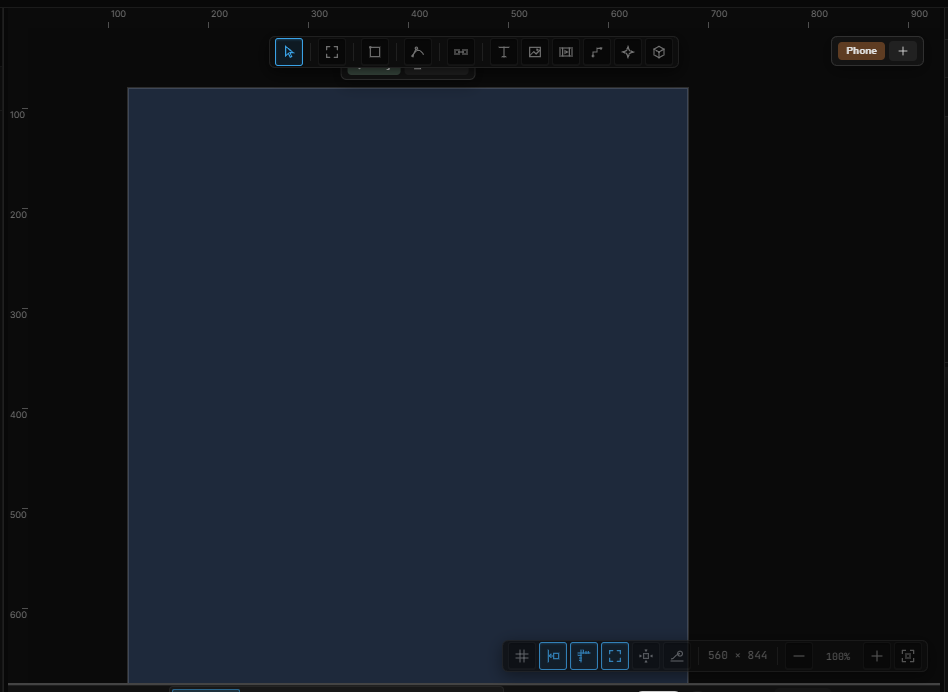
- Draw an artboard with A. It is born Fluid, and two chips appear at the top right of the canvas: Desktop and Phone.
- Put a button in the corner. In Properties › Responsive, click the box's right edge and bottom edge.
- In the W × H fields beside the screen chips, type a narrower width. The artboard previews at that size and the button rides along with the right edge.
- Type a width under 600: the Phone chip lights up. Anything you change now — hide the menu, make the grid one column — belongs to the Phone screen only. Press ↺ and Desktop comes back untouched.
02Fit — how the artboard meets the window
Select an artboard. Fit on Transform decides what happens when the scene plays in a window that isn't the artboard's size:
| Fit | What happens | Use it for |
|---|---|---|
| Fluid (fills the window) | The artboard becomes the window. Layers follow their Responsive rules, layouts reflow, Screens switch. The default for new artboards | Sites, apps, anything interactive |
| Fixed stage | The artboard keeps its size and is scaled to fit, with empty margins if the shapes differ | Video, presentations, a fixed composition |
| Fill (cover) | Scaled to cover the window; whatever spills past the edges is cropped | Full-bleed backgrounds and hero visuals |
Scenes saved before this existed open as Fixed stage and behave exactly as before.
03Responsive — what a layer does when its parent resizes
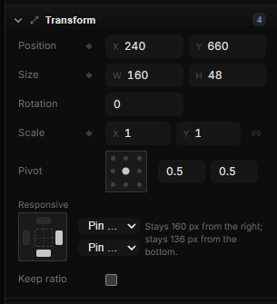
Select any layer inside an artboard, a frame or a group and open Responsive on Transform. It answers one question: when the container gets wider, narrower, taller or shorter, what does this layer do? The same rule applies however the container changes size — its handles, a number typed in Transform, or the window when the scene plays.
The pin box
Click an edge of the small box to pin the layer to that edge — the distance to it is kept. Click the opposite edge too and the layer stretches between them. Click neither and it keeps its center. The two pickers beside the box say the same thing in words, and add one more choice:
| Horizontal | Vertical | The layer… |
|---|---|---|
| Pin left | Pin top | keeps its distance to that edge and its size (the default) |
| Pin right | Pin bottom | keeps its distance to the opposite edge |
| Keep center | Keep middle | keeps its offset from the middle |
| Stretch | Stretch | keeps the distance to both edges — its size follows the artboard |
| Scale | Scale | grows and shrinks with the artboard, position included |
The sentence under the box reads the rule back to you — Stays 24 px from the right; width follows the parent, 40 px from the left and 40 px from the right — so you can check it without resizing anything.
Limits and ratio
When a rule changes the layer's size, two more rows appear:
- Width limits and Height limits — a minimum and a maximum in px. 0 means no limit. A card that stretches but must never get narrower than 280 px is Stretch with a minimum width of 280. When a limit cuts in, the layer stays anchored the way its rule says: a right-pinned layer keeps its right edge, a centered one stays centered.
- Keep ratio — when only one side changes, the other follows to keep the aspect. A stretched image with Keep ratio on gets taller as it gets wider.
Groups
A group is a container: when it resizes, its children need a rule too. Contents on a group decides — it sits under Responsive, or straight in Transform for a group at the top level:
- Keep layout — children follow their pins — every child uses its own Responsive settings, all the way down. This is how a header stretches full width while its logo stays left and its menu stays right. A frame always works this way.
- Scale content — like a group — everything inside scales proportionally, like an illustration. Groups made with Ctrl+G start this way.
A group with a Layout reflows instead: give the group Stretch and its grid or stack re-solves at the new width, and children set to Fill in Item Layout grow with it.
04Previewing at any size
You don't need the player to see the result.
- Type a size. The W × H fields beside the screen chips preview the design at any resolution without changing it. Everything responds live, and the matching screen switches on its own. ⇄ swaps width and height to check portrait. ↺ returns to the design size.
- Drag the handles to resize for real. Dragging a page's handles changes its actual size — only that page, with its children following their pins. The left and top handles grow it to the left and upwards. It is one undo step.
- Editing at a preview size adopts it. Change a layer while previewing and that size becomes the size this screen is designed at — on Desktop, the artboard's own size. Moving or resizing the artboard itself doesn't count.
05Screens — a different layout for phones and portrait
Pins carry a layout a long way, but a three-column grid can't become one column by stretching. Screens give the same layers a second arrangement.

- Desktop is the base: the design as you drew it. Every other screen is a set of differences on top of it.
- Phone shows when the window is at most 600 px wide or taller than it is wide — a phone held upright, a portrait wall.
- + adds Tablet, Laptop, Wide, Portrait wall, or a Custom… screen. Click an active screen's chip again to open its editor: name, reference size, when width ≤, or portrait, Remove.
When more than one rule matches, the one with the narrowest width wins; a rule that is only "portrait" comes after any width rule. Nothing matching means Desktop.
Editing a screen
Click a chip. The Fluid artboards jump to that screen's reference size, its rules apply, and from now on every change belongs to that screen: positions, sizes, hidden layers, layout settings, item layout. A row you have changed shows a ↺ in Properties; click it to go back to the Desktop value. Switch back to Desktop and the base design is exactly as you left it. Changes made on Desktop flow to every screen that hasn't overridden that value.
Ctrl+Z works inside a screen like anywhere else, and an undone change is not kept as an override.
When it plays
In the player the window decides. Resize it, rotate a phone, drop it into a narrow iframe: the matching screen switches in, then the artboard fills the exact window and the Responsive rules take it the rest of the way. Screens are designed at their reference size; pins handle everything between.
06In sentences
Screens are part of the interaction language, so a design can react to the window rather than only reflow:
- ⚡ Screen becomes — a trigger, in the Scene group or on a layer. Pick Any screen, a named screen (Phone), or Portrait / Landscape for the stage turning. Screen becomes Phone → Set Layout, columns 1 is one sentence.
- ∿ Screen width, Screen height, Screen aspect, Portrait — streams in the source picker under Screen. Screen width → Map Range 390…1440 → 16…40 → Font size is fluid typography without a keyframe.
- On screen — 1 while the named screen is active. Put it in a step's Guard to make a click open a drawer on Phone and a side panel on Desktop.
Screen-size streams read the stage: the window when the scene plays, the preview size in the editor. In expressions the same values are $screen.width, $screen.height, $screen.aspect, $screen.portrait and $screen.is('Phone').
07Shortcut recap
| A | Draw an artboard (Fluid, with Desktop and Phone ready) |
| W × H beside the screen chips | Preview at that size — not an edit |
| Drag a page's handle | Resize the page for real; children follow their pins |
| ↺ in the chip strip | Back to the design size |
| ↺ on a property row | Back to the Desktop value |